Photo Critique for Greenie
Recently, I’ve gotten more involved with taking photos.
My friend Greenie recently asked me to have a look at his photos and with kind permission from him, I thought it would be helpful to share some insight to the methods of my madness, so to speak, and so it is why this article came about.
Greenie currently works as a Trooper in the Household Cavalry Regiment, in Windsor and is learning photography as part of his resettlement course. The photos he took were from two events: one early morning rehearsal (3am to 6am) for the State Visit of the President of Mexico to the UK and the actual day of the visit itself (3rd of March 2015).
First of all, I’m using Adobe Photoshop CS6 to annotate (very minimally, I realised after) the photos he took. I normally use Adobe Lightroom to manage my own photos and the screenshots are shown below of the common tools I use.
I’d say I try not to get bogged down by the technical aspects of my camera because it’s very impractical to having to constantly calculate every aspect and numbers of every shot. In most cases, I shoot in aperture priority mode. As a rule of thumb, if I want to isolate my subject, I use a small aperture (not always the smallest (f2.8) on my CZ 24-70mm because the focus can sometimes be wrong), and if I want to focus a lot of the photo, I use the middle – opposite end of the aperture. Usually f7 to f9 works. I find that beyond this, the shutter speed slows down so much that shake becomes a real problem. Not really what I want happening on key moments and fast paced shots, not to mention subjects that don’t stay still (horses for example). However, I’d like to talk about 4 things that I consciously think about when I take photos:
- Focus
- Angle
- Frame/Crop
Focus
Greenie took several shots that would have been much nicer had the focus been at the right subject. Granted it is very tricky to shoot in the dark and wrong focus happens to the very best of us. I would suggest that for low light shots, where there is not a lot of action involved, I’d switch to manual focus and take the time to compose the shot. Or if that is far more troublesome, take the moment to review your previous shot and analyse to see if the focus is where you wanted it to be.

Incorrect focus
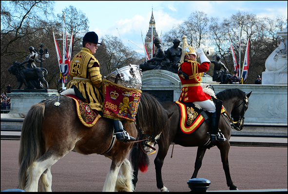
This next photo of the our trombonists with the big clock on the ceremonial gate is pretty spot on. I like how the 4 of them are in focus.

Our trombonists correctly focused.
Framing/Crop
The previous photo actually brings me to my next heading which is framing the shot. Typically, I spend a good second or two trying to frame the subject as close as to how I want the photograph to be, which helps massively reduce my post-processing time. Of course, it may not always not be possible especially when you need to take shots very quickly. And this is where the crop tool in Lightroom really helps a lot. In fact, ‘R’ is perhaps my most used keyboard shortcut. The crop tool in Lightroom not only allows you to re-frame the shot, change the orientation of the shot by pressing ‘X’ but also straighten the photo. One of my biggest pet peeves is having slanted unintentional horizontal lines. I have been known to have an OCD to straighten wonky frames on walls.
Anyway, as I have digressed, I feel that this shot could be improved by cropping it to remove the man on the right out of the photo. He doesn’t bring anything to the main subject so he had to go. Cropping slightly tighter to accentuate the Blues and Royals trombonists also helps make this photo more effective.
Another rule of thumb I like to work by is to use the Rule of Thirds. Note that the Blues and Royal’s red plume lies directly on the right third guideline. I would have lowered the top guideline to where his eyes/ears are but that would take the clock out of the frame and the tip of the plume would be touching the edge of the photograph.
Get rid of portions of the photo that don’t bring anything to enhance your subject, where possible, by cropping them out.
Sometimes, because of the lens we use, it is physically impossible to frame the shot until post-processing. Usually, I find that is the case when photographing portraits. Sometimes there is far too much empty space above their head or beyond their immediate personal space. It can make a photo a little less intimate, and risk overwhelming your viewers if you have a very busy background.
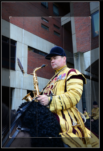
I’d have probably lowered the top guidelines where Tim’s right ear is for a more satisfying application of the Rule of Thirds. Notice by cropping tigher, I removed the blurred man at the back.
Angle
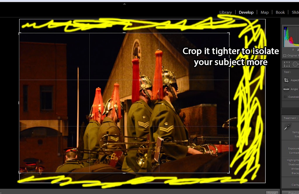
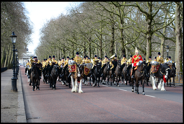
What goes hand in hand with framing the shot is, of course, the angle of the shot. Sometimes a particular angle makes or breaks your photo. I think Greenie’s had the right idea of capturing angled shots to not only show his main subject in a unique frame but also show highlight the grandiosity of the place. This photo of the Regiment going through the Wellington Arch has got some good ideas. However, this photo would have been much better if the horses’ hooves were not cut off. Better positioning would definitely have helped. I personally I’m not a big fan of when the main lines of photo converges at an odd angle (the Arch vertical lines are slanted). Again, that’s probably just my OCD kicking in.

Too tight framing leaving the horses’s legs cut off. Otherwise would have been a great shot of the LIfeguards.
Good shots
There are many good photos from the set he gave me but these are the ones I personally like the most. I did some minor corrections, including enhancing contrast, changing the exposure and cropping.

It was a bit white washed because of how bright the day was so I adjusted it slightly. I realise that the sky looks terribly unnatural as I went slightly over with the reducing the ‘Highlights’. This is also cropped.

Corrections I made for the previous photo.
Only just cropped it.
This photo’s got good accurate vertical lines (lamp and trees) . In fact, I didn’t have to straighten this at all.

Good dressing! (Cropped)
I hope these few critiques are useful to Greenie.
I’m interested in hearing your views so feel free to comment here to get the discussion going.